


People tasked with collecting and sorting data often spend their days sifting, combining, and preparing it to be seen and understood via data visualization. Data visualizations are graphic representations of all the data crunching and manipulation. Visualizations present data in an easy to understand way. This is of course if your visualization makes sense and presents the data effectively. Many presentations go awry when they present the wrong visualization for the data they intend on showcasing. This can confuse the intended outcome of the visualization.
TIBCO is an enterprise-level software company that can help you explore, create, and deliver types of data visualization for any solution. They can help with education, support, and consulting. Forbes magazine says that by 2025, we will get most of our information from data-driven narrative storytelling. The trick is to understand the best way to visualize your data so that it is easier to understand. The idea is to highlight the insights from your set of data. From charts, graphs, or heat maps we will help you with five of the best ways to visualize your data.
1. Indicators demonstrate KPIs effectively.
Contents
If you want to display one or two numeric values, you can use Indicator visualizations. You can add titles and color-coded icons such as green “up” arrows or red “down” arrows to represent the value. These visualizations are useful when you want to demonstrate an immediate point of how well the business is performing on a particular KPI. A simple “gauge indicator” could show you immediately whether you’re above or below a goal, and whether or not you’re moving in the right direction. You can also incorporate custom indicators and visuals to make your presentation pop.
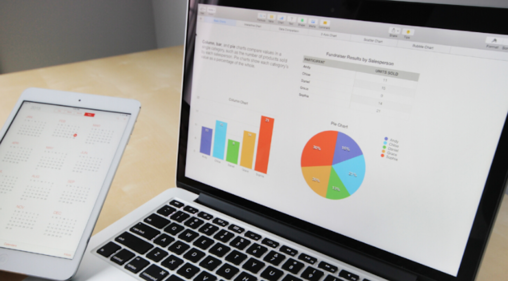
2. You need charts that look at a value comparison


The column chart is best used for comparing multiple items of data. The usefulness of this visualization is that the column chart can use values on both the X and Y-axis. This chart can also break down categories displayed on the Y-axis. It makes the most sense to use column charts for side-by-side comparisons of different values. Bar charts allow for a comparison of several different values. The bars on these charts are broken into color-coded categories for easier comparison.
Bar charts present categories or items along the Y-axis, with their values displayed on the X-axis. The line chart is one of the more popular charts because it demonstrates value trends easily. The two most useful aspects of the line chart are that it allows you to compare data over time, and compare trends for more than one group or category. Line charts are resoundingly popular because they can show overall trends quickly and concisely. With so many options for data charts, experts at MIT make it clear that they are only effective if you choose one that will easily be understood by all.
3. Pie charts show proportions


Pie charts easily show the parts of each whole set of data. They’re more effective than just a list of percentages. Since the pie chart represents the relationship between the parts and the whole, the parts need to add to a meaningful whole data set. Scatter charts show categories of data represented by colored circles. The volume of the data is shown by circle size. These charts are used to reflect the number and relationship between the two variables.
4. Pivot tables easily present key values
Pivot tables are one of the easiest and most helpful ways to visualize data. These tables allow for large amounts of data to be analyzed and summarized quickly. Pivot tables may not be the most beautiful choice to visualize data, but they are useful for quickly extracting key figures. They allow you to see exact numbers rather than get a sense of trends. You can also use additional features such as color formatting and data bars to enhance the visual aspects.
5. Area maps demonstrate geographic data


Area map data visualizations allow you to see which geographical locations are significant for your data set. Data is visualized as points of color on a map. The values are usually represented by circle size. Larger or smaller geographical data points are displayed across a region a map so that you can visualize the quantity and location of data. Usually, up to two sets of numeric data are used on these maps effectively.
A graphic representation of data is a very important part of presenting and explaining information. Whatever data visualization you choose needs to speak to the audience, use the right visuals, provide context for the data, be simple and digestible, and designed for user engagement. Showcasing your data this way will make for powerful and purposeful presentations.