
Gmail is receiving a huge update in terms of design today. The rollout is taking place in a phased manner, meaning not everyone will receive it at the same time. Along with the fresh elements, there are also some interesting and helpful features.
The design is modern, it might not seem very different compared to previous design but it’s those little tweaks that make up for a much more pleasant interface. The most noticeable tweak, is the removal of boxes; everything fits comfortably on a plain white background.
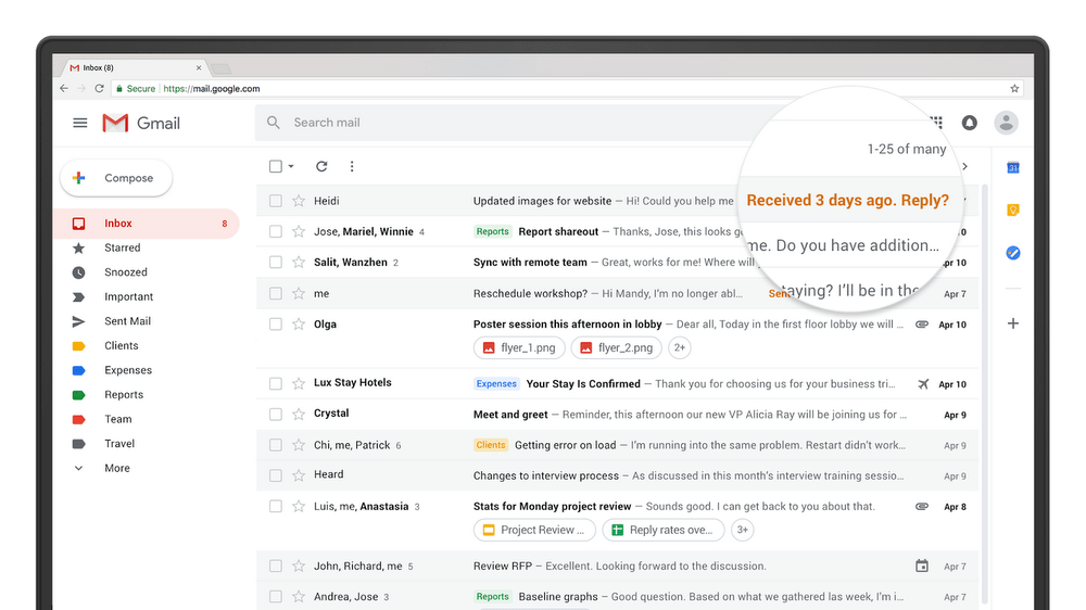
The font used for labels is new and it’s much more punchy with its colour. The compose button is kind-of alien but it’s cool; it reminds me of Motorola Assist’s icon. Also, just like on Android, the menu bar collapses but unlike Android, in Gmail the menu when collapsed shows tiny icons. The icons can also show badges to highlight untended mails.
The new design highlights white a lot. Most of the background area is white unless of course, the user shifts to a different theme. The search bar is huge, just like the one present in ‘Inbox’, another Gmail client-app by Google which never took off.
The new Gmail sports a bar on the right containing a stack of apps or as the company call them “add-ons”. By default Google Keep, Calendar and Google’s new Tasks application are placed in the sidebar. Below the add-ons section resides a button to add more apps.
The add-ons make for the most interesting feature Google has added to Gmail since a long time. The apps placed by default are the ones used by most people and are easier to access without leaving the email client. However, the apps take 3-5 seconds to load on a decent computer with a decent internet connection; it would probably be worse on a slower machine.