
Only hours after hearing that all we’ve heard about iOS 7 so far is wrong, reports have done a complete 180 and it now appears the icons to be used in iOS 7 have been leaked, which is due to be revealed today at WWDC 2013.
![]()
The guys over at 9to5Mac have been provided with a sneak peak of an early beta of iOS 7 and have described it in detail.
The entire UI of iOS 7 has in fact been redesigned with flat icons, as pictured above, together with other elements, as well as a new font similar to that of Helvetica Nueue Ultra Light.
According to the leaks, the iTunes icon has gone with a purple-ish gradianted icon, with the camera going for a grey look.
“Perhaps most interesting: There are two color schemes for many of these apps – one black-ish and one white-ish. We’re not sure if they are A/B decoys, if white iPhones and Black iPhones will have their own color schemes or as someone else suggested, the different color schemes might be invoked by the amount of ambient light or the time of day. But it is super-interesting, especially since we’ve heard whispers that the whole UI might shift slightly based on external factors similar to the way the music volume icon switches based on how you hold the iPhone.”
It seems iOS 7 will feature two colour schemes, and when the user is in black-mode the keyboard will be black with grey letters, opposed to grey keys with white letters for the lighter colour scheme.
iOS 7 Icon Leak
Here’s a concept of what the new icons will apparently look like:
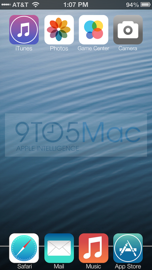
The dock also seems to have been changed; gone is the reflective dock we’re used to seeing, and instead it has been replaced with a straight white line.
9to5Mac are usually pretty spot on with their information so it seems solid evidence that iOS 7 will in fact look like this.
If this is iOS 7, what do you think?