


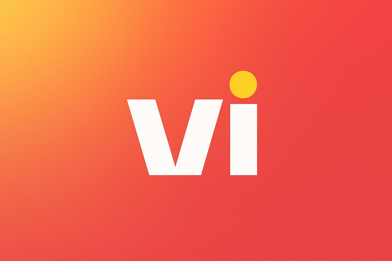
A familiar name is taking on a refreshed identity as Vi begins a new chapter with a subtle yet meaningful change to its logo. The telecommunications company has moved the signature yellow dot to the top of the ‘i’, creating a visual shift that reflects its broader ambitions for the future.
While the logo change itself is simple, it represents a larger direction for the brand. Vi has positioned the refreshed identity around its focus on building a stronger network, improving customer experiences and introducing new propositions in the months ahead.
A Small Change with A Bigger Meaning
The updated logo is designed to represent progress and upward movement. The yellow dot, now positioned at the top of the ‘i’, reflects where Vi says it is headed; towards stronger connectivity and a more rewarding experience for its users.
The change comes as the telecom sector continues to evolve, with customers expecting reliable connectivity, convenient digital services and greater value from their mobile plans. Against this backdrop, Vi’s refreshed identity signals its intent to continue evolving alongside these expectations. Importantly, the new logo does not require existing customers to make any changes to their services.
What Does the New Vi Identity Mean for Customers?
For existing Vi users, the transition is designed to be seamless. Customers can continue using their existing mobile numbers, SIM or eSIM, plans and benefits as before. There is no automatic change to current plan prices or recharges.
Bundled benefits, including OTT subscriptions and other plan-specific offerings, also continue according to the terms of existing plans. Premium postpaid benefits, priority services and dedicated support remain available where included. Customers who need a replacement SIM or wish to move to an eSIM can continue to use the Vi app or visit a Vi store.
Looking Ahead
The refreshed logo is being positioned as the beginning of a broader evolution rather than a standalone visual update. Vi has indicated that further improvements to its customer experience and new propositions will be introduced over the coming months.
Customers can continue accessing Vi’s services through its existing website and app, with the latest version of the Vi app recommended for users. Existing customer support channels and store locations also remain available.
With its new logo, Vi is signalling a forward-looking approach while keeping the transition familiar for iidents existing customer base. The change may be small on the surface, but it represents a larger ambition for what the brand hopes to build next.