


The world has gone mobile. We wake up and check our phones. We work from our tablets at coffee shops. We manage our lives through a collection of apps that are always with us. So, why do so many B2B SaaS products still treat mobile as an afterthought? The data doesn’t lie: in 2023, nearly 60% of all web traffic came from mobile devices, and this number is only projected to grow. For SaaS companies, this isn’t just a trend; it’s a fundamental shift in how users expect to interact with software. If your product’s analytics dashboards look broken on a phone, you’re not just creating a frustrating user experience; you’re actively hindering your customers’ ability to get value from your product.
This is where mobile-responsive analytics comes in. It’s not about simply shrinking a desktop dashboard to fit a smaller screen. It’s about rethinking the entire analytics experience from a mobile-first perspective. It’s about delivering the right insights, at the right time, on the right device. In this article, we’ll explore why mobile-responsive analytics are no longer a “nice-to-have” but a critical component of any modern SaaS product. We’ll dive into the latest mobile analytics trends, discuss the principles of responsive dashboard design, and explore how a mobile-first approach to SaaS UX can be a game-changer for your business.
The Rise of the Mobile-First Professional
Contents
Not too long ago, the idea of a CEO checking sales forecasts on their iPhone between flights might have seemed like something out of a sci-fi movie. Today, it’s the norm. The modern professional is no longer tethered to their desk. They are constantly on the move, and they expect their tools to keep up. This shift has profound implications for SaaS companies, especially when it comes to analytics.
The Anywhere, Anytime Office
The concept of the 9-to-5 workday is quickly becoming a relic of the past. With the rise of remote work and flexible schedules, professionals need access to critical business data wherever they are. A sales manager might need to check their team’s performance while waiting for a client meeting. A marketing director might want to review campaign metrics while commuting home. If your SaaS product doesn’t provide a seamless mobile analytics experience, you’re forcing your users to wait until they’re back at their desks to get the information they need. This delay can mean missed opportunities and slower decision-making.
The Consumerization of IT
We’ve all become accustomed to the slick, intuitive interfaces of consumer apps like Instagram, Uber, and Spotify. These apps have set a high bar for user experience, and that expectation now extends to the B2B world. When a user logs into your SaaS product on their phone, they expect the same level of polish and usability they get from their favorite consumer apps. A clunky, non-responsive dashboard that requires endless pinching and zooming is a jarring experience that reflects poorly on your brand. It sends a message that you don’t value your users’ time or understand their needs.
Designing for the Small Screen: Principles of Responsive Dashboard Design
Creating a great mobile analytics experience is about more than just technology; it’s about design. A dashboard that’s cluttered and confusing on a desktop will be a nightmare on a mobile device. Here are some key principles to keep in mind when designing responsive dashboards.
Less is More
Mobile screens are small, so you need to be ruthless about what you include. A mobile dashboard should focus on the most critical, high-level metrics that a user needs to see at a glance. Think of it as a “greatest hits” collection of your data, not the entire album. This is where a deep understanding of your users’ needs is crucial. What are the one or two numbers they absolutely need to know when they’re on the go? Start there.
Think in Blocks
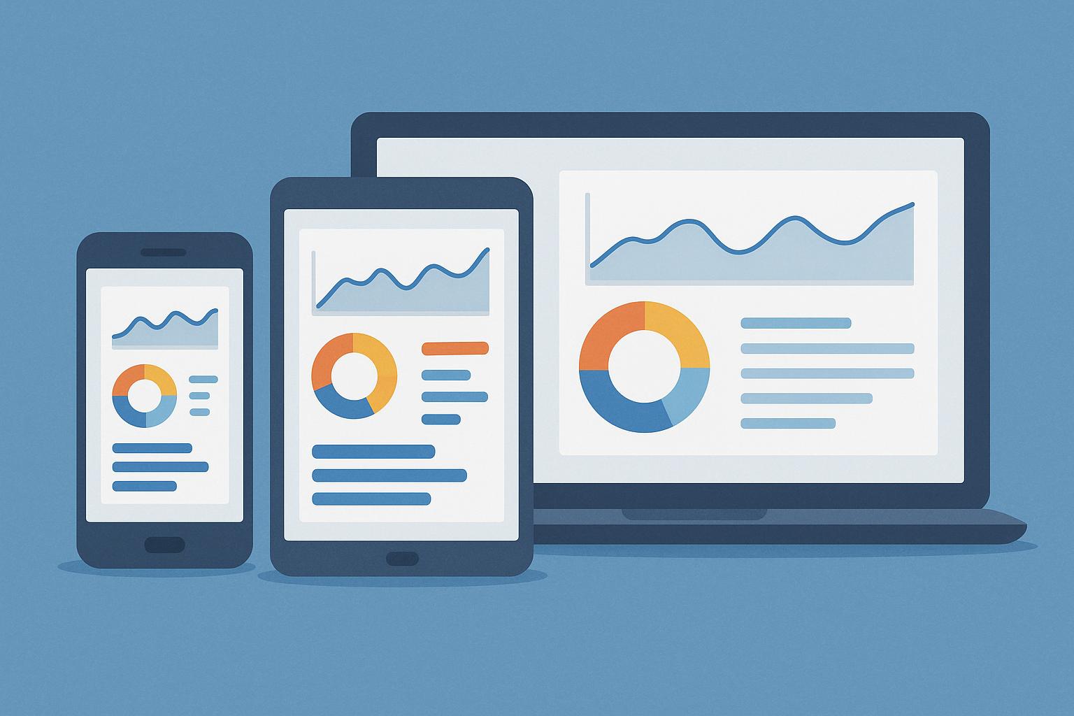
Responsive design is all about creating a flexible layout that can adapt to different screen sizes. A common approach is to use a modular, block-based design. Each block can contain a single chart, metric, or visualization. On a desktop, these blocks can be arranged in a multi-column grid. On a mobile device, they can be stacked vertically in a single column. This approach ensures that your dashboard is always readable and easy to navigate, regardless of the device.
Embrace the Fold
On a mobile device, the “fold” — the bottom of the screen that’s visible without scrolling — is prime real estate. This is where you should place your most important information. Users should be able to get a snapshot of their key metrics without having to scroll. As they scroll down, they can access more detailed information and secondary metrics. This creates a clear visual hierarchy and makes it easy for users to find what they’re looking for.
The Power of a Low-Code Platform
Building and maintaining a truly responsive analytics experience from scratch can be a massive undertaking. It requires a significant investment in development resources and ongoing maintenance. This is where a low-code customer-facing analytics platform can be a game-changer. You can create beautiful, fully responsive dashboards with a drag-and-drop interface. The platform handles all the complexities of responsive design, so you can focus on what matters most: delivering value to your customers. And with features like a custom PDF builder and multi-tenant security, you can provide a truly white-label experience that feels like a native part of your product.
Mobile-First SaaS UX: A Competitive Advantage
A mobile-first approach to SaaS UX is about more than just aesthetics; it’s about creating a product that’s genuinely useful and valuable to your customers. By prioritizing the mobile experience, you can gain a significant competitive advantage.
Increased Engagement and Adoption
When your product is easy to use on any device, your customers are more likely to use it. It’s that simple. A seamless mobile experience removes friction and makes it easier for users to integrate your product into their daily workflow. This leads to increased engagement, higher adoption rates, and ultimately, lower churn. In a competitive SaaS market, a great mobile experience can be the deciding factor that keeps a customer from switching to a competitor.
Faster Time to Insight
The goal of any analytics dashboard is to help users make better decisions, faster. A mobile-responsive dashboard puts critical insights directly into the hands of your users, wherever they are. A field sales rep can pull up a customer’s purchase history right before a meeting. A project manager can check the status of a project while on the go. This ability to access real-time data on any device empowers your users to be more proactive and data-driven.
Future-Proofing Your Product
The shift to mobile is not a passing fad. It’s a long-term trend that will only continue to accelerate. By investing in a mobile-first approach to analytics today, you’re future-proofing your product for tomorrow. As new devices and form factors emerge, you’ll be well-positioned to adapt and continue to provide a great user experience. And with the right embedded analytics solution, you can do it all without having to write a single line of code.
Conclusion: The Future of SaaS is in Your Pocket
The days of being chained to a desk to access business-critical data are over. The modern professional expects and demands a seamless, intuitive mobile experience from their SaaS tools. For SaaS companies, this means that mobile-responsive analytics are no longer a luxury; they are a necessity. By embracing a mobile-first approach to design and UX, you can create a product that is not only more engaging and valuable to your customers but also more competitive in the marketplace.
The journey to a truly mobile-first analytics experience can seem daunting, but it doesn’t have to be. By focusing on the principles of responsive design, understanding the needs of your users, and leveraging the power of a low-code embedded analytics platform, you can create a mobile experience that will delight your customers and drive your business forward. The future of SaaS is in your pocket. Are you ready for it?