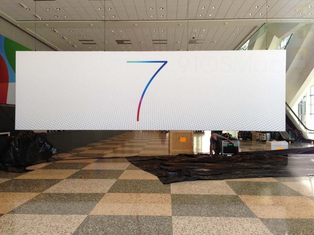
Since iOS 7 was introduced, the reactions have been very mixed to say the least; some are happy with the new minimalistic UI with flatter icons and gradiented colours, whilst others feel like it is a bit of a mess. Given the vast visual variation that iOS 7 brings compared to iOS 6, developers will be forced to upgrade their Apps in order to ensure that they blend in with the new iOS 7 design look.
iOS 7 Changes
Everything about the look of iOS 7 has been modified and tweaked, including textures, colours, buttons, navigation arrows, keyboards, icons, dials etc. In order to blend seamlessly with Apple’s new design, developers will be forced to update their Apps in order to prevent sticking out like a sore thumb.
Think about putting an iOS 6 App next to an iOS 7 App – they will look starkly different. Whilst Apple isn’t forcing developers to update their Apps, it will be in their best interest to ensure their Apps are optimised for iOS 7 design.
As noted by a UK developer Entropy who is stuck in such a situation:
Remember what non-retina enabled Apps looked like when the iPhone 4 was released? Well, this has the potential to be worse – much worse. And remember when many people said that iPhone-only Apps would look “just fine” on the iPad when blown up to 2X scale. Yeah, that argument didn’t last long.
Simply put, pre-iOS 7 Apps running on the new OS stick out like a sore thumb – looking aged, clunky, and well…just ancient.
With iOS 7 touted for a fall release, it will be in developers best interests to ensure that they work to design their App in a way which will blend with the design of iOS 7.
Are you a developer? If so, what are your thoughts on the issue surrounding design in iOS 7? Drop us a comment in the section below.


