
We’ve seen numerous iOS7 concepts in recent weeks, with many attempting to tangibly demonstrate the rumors we’ve heard about Jony Ive’s new OS redesign. The latest iOS7 concept iOS7 concept by Steve King allows you to view a potential iOS7 design in HTML, including such gestures as “slide to unlock” and tapping on iMessage in order to open up the text application. Let’s get into the details of Steve King’s iOS concept.
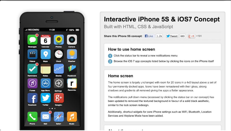
iOS7 Concept: Basic Operations
Contents
King’s iOS7 concept allows you to perform normal operations you would expect when using an iPhone, such as pressing the power button (standby button at the top right of the iPhone 5) or pressing the home button in order to arrive at the main page. The iPhone to the left of the page shows you the power/standby button with the words “Turn me on here.” The home button is in the right place, at the bottom middle of the front display.
iOS7 Concept Includes WWDC Lock Screen Wallpaper
When you touch the on-screen home button for the iOS7 concept, you are taken to a lock screen where the WWDC logo is located. The number 7 is etched on the purple square in white, and is surrounded by other squares behind it. This concept sparks some excitement for Apple’s grand announcement next week on June 10th.
iOS7 Concept Includes Rumored New Colors
Beneath the iPhone 5 concept in iOS7 are the words “select colour,” and there are six colors to choose from: black, white, red, blue, pink, and orange. As Steve King quotes, “The interface and app designs are based on rumours from multiple sources, and this is our interpretation based on this fact.” The colors are another rumor that we’ve also heard from multiple sources.
Since Apple’s iPod Touch line (the iPod Nano and up) has featured a few color preferences, many say that Apple’s iPhone 5S will come in a variety of colors. Apple is preparing for its Worldwide Developers’ Conference (WWDC 2013) next week, and one of its banners in the Moscone Center, where the conference is held, contains multi-colored squares — perhaps a reference to Apple’s decision to go with a color variety for the iPhone 5S. According to Cult of Mac’s John Brownlee, the colored squares refer to the next-generation iPhone:
…Apple intends on launching a colored range of iPhones in June. Previous rumors pegged this colored iPhone as the 5S, but Tim Cook in last night’s earnings call openly said not to expect major new products from Apple until fall, so if it were to be anything, it would likely be a colored iPhone 5 variant.
iOS7 Concept Includes Plain Icons
One of the rumors surrounding Jony Ive’s redesign of iOS7 is the use of plain shapes in place of shadowed colors that Steve Jobs and Scott Forstall used in iOS6. Many believe Ive’s redesign will inaugurate a “deForstallization” of iOS6, and King’s concept affirms the same. The music icon at the bottom dock has removed the different shades of orange, with a plain display.
The “reminders” icon is also different, using a white check in place of the old icon that featured checks on white legal paper. The messages, stocks, settings, App Store, and iTunes icons all show plain backgrounds with symbols and colors reminiscent of what iPhone users remember.
When it comes to the “Notes” app, there is a small difference; while King removed the leather stitching at the top of the Notes icon, he could have done more with the legal pad to create a flat, contemporary look — maybe even included some cursive writing on a yellow background instead (a background without the lines reminiscent of legal paper).
Steve King’s iOS7 concept looks similar to the Windows Metro UI, but I have a feeling that it will differ dramatically from Windows. After all, Apple prides itself on the Cupertino trademark and originality. The iOS7 concept presented here is one that we’ll have to check for when Jony Ive presents the new iOS on June 10th.
What’s your favorite iOS7 concept so far? Recommend it to us in the comments.