
Apple”s iWatch is something that has been rumoured almost as long as the Apple TV set, but it”s yet to be released – some say due to difficulties with hardware, whilst others speculate it”s software related. However, that hasn”t stopped the endless floods of iWatch concepts coming in which mockup just how Apple would deliver such a product.
Some iWatch concepts have been rather out there, going against pretty much everything Apple design stands for, whilst others have taken a more traditional approach. The latest concept mockup by designer Todd Hamilton gives us a look at something which actually looks like an iWatch Apple could make.
Todd explains that his concept was based on a recent iWatch mockup by Thomas Bogner which was posted on Dribble, which looked like a cross between a Nike Fuelband and an iPhone. However, as Todd highlights, the concept had a major flaw in that the orientation of the interface made it impossible to use.
I had some free time over the holidays so I decided to take a stab at the problem and create a more user friendly concept. I wanted to nbso online casino reviews retain a slim form factor like the Fuelband and incorporate familiar UI components from iOS 7. It needed to feel natural on the wrist and look like something Apple would actually produce.
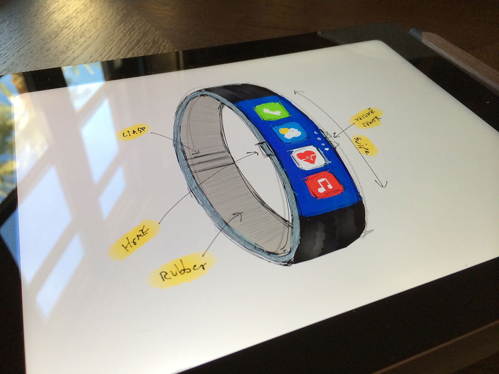
He explains how he created some initial sketches which then formed a rough 3D mesh of the device.
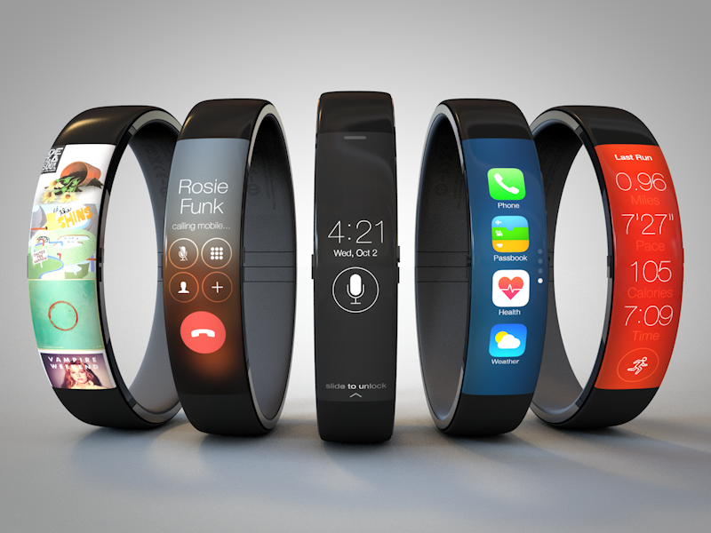
iWatch Concept
The iWatch features a curved touchscreen display on the front with a single physical button on the left to act as the home button, and a further two on the other side for the volume controls.
For the lock screen I designed a simple black & white interface displaying the time, date, and button to activate Siri. From here the possible actions are: tap to use Siri, swipe up to unlock, or pull down to view notifications. Sound familiar? While I was designing this I found myself pretending what it would be like to use swiping gestures on my wrist. Give it a try, it feels pretty good!
Todd has created what is a pretty good, and useable iWatch concept. The gestures he has proposed do actually feel pretty good, and you wouldn”t feel out of place performing them, should this be the direction Apple choose.
As for the App icons, there are four icons stacked vertically with a page indication on the right of the touchscreen.
I personally think the iWatch concept looks incredible and hope that if Apple are working on an iWatch that it looks something like this!
Thoughts?