 Price: Free Score: 8/10 Category: Social Networking
When the latest Twitter for iPad update hit the app store my Twitter stream was inundated. “Twitter for iPad is the best.” “So cool,” “So excited,” etc. There was a flood of praise minutes after the release, and then I saw another tweet. A guy named Leon Zandman seemed to have hit the nail on the head.
“The new official Twitter client for iPad: a beautiful mess…” he tweeted, and I agree with him completely. There’s no doubt that Twitter is one of the most innovative apps out there. Its layered screen options and multi-touch gesturing technology are absolutely wonderful. There’s something about flicking through different screens that feels incredibly intimate, and I love being able to see something in a browser without leaving my Twitter stream. This change alone is significant for Twitter’s entire user experience.
What’s even cooler about Twitter for iPad are the multitouch options. (Twitter is trying to figure out the best way to help users through the gesturing learning curve.) When you pinch on an individual tweet the person’s user profile pops up, showing their most recent tweet, location, bio, website, following to follower numbers, @ mentions, Tweets, and Favorites. Again, it’s great that there’s a way to see more information about a Twitter user without having to lose your spot wherever you are. Plus, the very act of pinching and then clicking somewhere else to make the profile information disappear only do the same over again feels revolutionary.
You can also swipe down with two fingers on a conversational tweet to see the entire exchange in context and easily switch from one account to another on the far left hand sidebar. This is a complete Twitter overhaul, but all the shiny new functions weren’t enough to leave me in awe.
After all, the app has already crashed on me four times and I sometimes feel like the swipe functionality is sticky. Last but not least, the whole experience feels suddenly cluttered and chaotic. It’s great for a casual user experience, but if you’re on Twitter to read real news, or if you’re one of those people that is insistent on reading every Tweet, there’s nothing to say that you won’t lose your place in the experience.
I’m also still waiting for the official Twitter app to give me some sort of means for tracking the unread Tweets in my stream, but that’s beside the point for this update. What’s important is how it’s changed with the revamp and how it works now.
In its most basic form, Twitter for iPad works in layered screens. If you don’t have an account you can sign up straight from the app with a few simple steps, but if you have an account (or accounts) you can just sign in to get started.
Once you’re in, your account(s) stays on the left side of the screen in a dark column. Under your account name and profile picture are subcategories with buttons that include Timeline, Mentions, Lists, Messages, Profile, and Search. Each button pops out to the right of your profile information and does exactly what it says, with search sending you straight to a list of trending topics below the search bar.
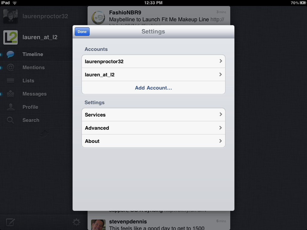
There’s also a settings icon at the bottom of your black profile information screen that lets you sign into more accounts, change settings like image quality, text expander, which photo and reading service you use (e.g. yFrog, Instapaper, ReaditLater) and more.
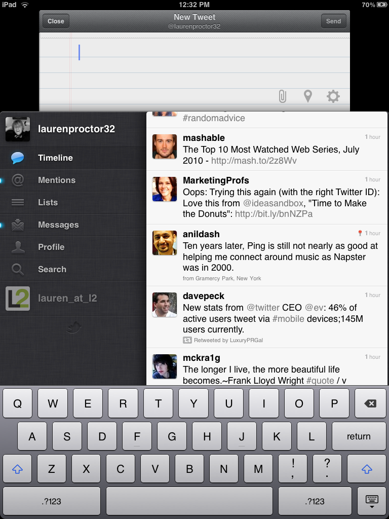
If you want to compose a message, you click on the compose button on the lower left hand corner of your black profile panel. When you click compose your keyboard pops on the bottom and a notepad looking New Tweet box pushes whatever you have open down so you can compose your message.
When you write the number of characters count down, and you can attach a photo from your library, display your current location, or shrink URLs from within the compose button. To send you press send, and to cancel you press close. If you close the app will ask you whether you want to save or discard your draft. Overall it’s a great compose feature but I feel like it makes everything feel crowded.
When you’re actually navigating your screen, you can pinch profiles to view more information (as well as favorite, reply, translate, mail tweet, copy link to tweet RT, quote tweet, etc). You can also drag down with two fingers to see a conversation, click and hold on a link to add it to a service like ReadItLater.
To actually view a link within the app, you click on it. At that point a third section overlay will pop up in a browser-like view. All the main functions are available on the top right hand corner of the display (e.g. reply, RT, quote tweet, mail tweet, etc) and you can use the lower right hand corner to open the page in Safari, copy the link, or read the link later. To scroll from link to link in your stream, you just press the arrow button on the lower left hand corner of the browser overlay.
The coolest part of this function is the ability to press a full screen button that makes the webpage fill the screen for easy reading. Then when you’re done you press done in the upper left hand corner and you’re back in business.
From there you can slide screens to change your overall focus, switch accounts, compose a tweet, and basically move to any of the aforementioned functions. There’s no doubt that this new iteration of Twitter revolutionizes the way we use the app. I just wish it was a little bit cleaner and a bit more reliable. The clean, less overwhelming feeling may just take some getting used to from the staunch traditionalists, and I’m sure Twitter will fix the crash issues in time.
Bottom Line: The latest Twitter for iPad is incredible. It’s beautiful, innovative, and redefining, but needs a lot of work.


