Back in 2008, social checkin apps were all the rage, attracting millions of users and big bucks from venture capitalists — it was the next big thing and folks were rushing to cash in. Pretty much everyone still thinks the future of the social mobile web is all about location (not to mention location, location and location), vendors and users are all a bit more cautious.
Gotta come right out and say it — Foursqure 5.0 (free) is a big, big improvement over earlier versions, both visually (nice update of the colors, layout) and functionally.
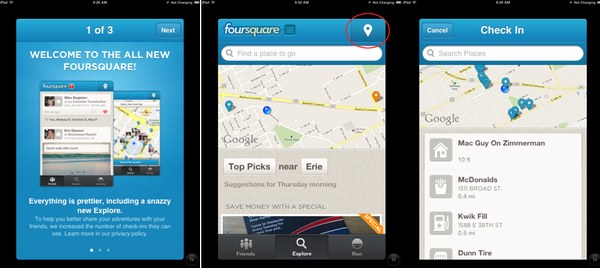
Previously, checking in required a bit of in-app navigation. In Foursquare 5.0, the user interface now includes a checkin button in the top right corner of the app. Further, tapping checkin, rather than just a plain jane text list of the checkin spots nearby, now represents a scrollable and searchable map of things nearby.
Also, tapping the Explore tab now presents a map rather than a text list of stuff. I’m not sure if which I prefer, but the map is more interactive and checking out a location — Starbucks, for example — puts more information (i.e. tappable map, photos, specials, tips, etc.) in front of you with a cleaner layout.
Yes, most of this info was available in earlier versions of Foursqure, but the presentation in v5.0 is more attractive and robust.
One feature conspicuously absent from Foursquare 5 is Radar, which notified users when they were near a location offering special events or values.
Foursquare is designed for iPhone and iPod touch. However, although still not a universal app, v5.0 is much more attractive and functional in 2X mode on my first generation iPad.
All-in-all, I am very much liking the new UI, easier checkin and more robust explore…
What’s your take?